
This page explains how to read, write, and use logarithmic graphs (or logarithmic plots) with examples.
- A logarithmic graph represents values in a successive ascending measurement for each fixed distance.
- It shows relatively small-value data with significantly large-value data on the same plot.
- Logarithmic graph is useful for showing data with various order of magnitudes.
Logarithmic Graph Super-Summary
Logarithmic Graph is Ascending Graph!
A logarithmic graph (or logarithmic plot) shows a value at a successive ascending scale for each fixed distance.
Let’s compare normal and logarithmic scales for better clarification:

Here’s a difference! At normal scale, a value increases by addition of 10 for each certain measure. However, at logarithmic scale, a value increases by a factor of 10 for each certain measure.
It is just like reading a scale at “one, ten, a hundred, a thousand, and so on.”
Type of Logarithmic Graph
A graph with a logarithmic scale on either x-axis or y-axis is called a Semi-Log graph. In contrast, a graph with both logarithmic axes is called a Log-Log graph.

Typically, an ascending scale in the logarithmic axis is difficult to read. Though, the concept of “successive scale” helps readability; the detailed content to ease reading is explained further.
Uses of Logarithmic Graphs
Before we learn how to read logarithmic graphs, let’s first understand how to use logarithmic graphs (because it makes them easy to understand).
Logarithmic graphs compare data with various order of magnitudes (i.e. numbers of digits.) Let’s look at some examples.
Example of Semi-Log Graph—Y-axis log scale
For example, the market size of four industrial sectors: A, B, C, and D is compared from 1950 to 2000; these data on a normal scale is shown below:
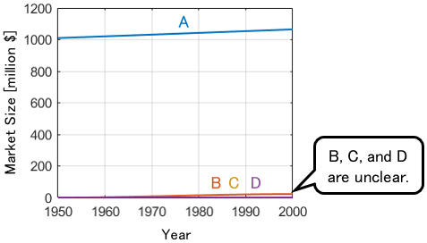
We can see that the market size of industry A is overwhelmingly large. However, this graph does not show the size of other industries. Let’s zoom in for industries B, C, and D plots.
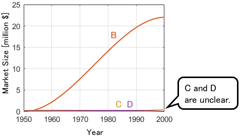
Now we can see steady growth in industry B over the past 50 years. However, the plots of industries C and D are still obscured. Let’s magnify it further.
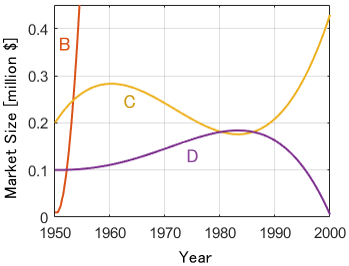
We can see industries B, C and D plots together. Of note, the trace of industry A plot is missing, and industry B is seen up to a certain extent.
Thus, an ordinary graph is unfit to present significantly large-value data with small-value data on the same plot.
A semi-log graph solves this problem: Herein, y-axis represents logarithmic scale.
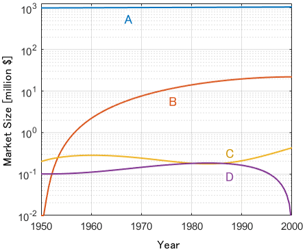
More Clear! We can see that industry A is a billion dollars in size, industry B is 10 million in size, and industries C and D are 100 thousand in size, respectively. You can also see at a glance that industry B started smaller than the others and that industries C and D were about the same size around 1980!
Like this, logarithmic graphs shows data with different magnitudes in an ascending scale in a same plot.
Example of Semi-Log Graph—X-axis log scale
The basic concept is similar to the previous example: herein, x-axis values with various order of magnitudes are compared.
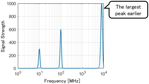
For example, the signal strength of a radio wave emitted by a machine is examined. An ordinary graph of the signal strength against radio frequency is shown below:

A strong signal is detected at 8000 MHz. There are some detected signals that are merged together on the left side.
A semi-log graph (x-axis log scale) shows the peaks clearly.
We observe signals at 10 MHz and 100 MHz!
Example of Log-Log Graph—X and Y axis log scale
The log-log graph consists both axis in logarithmic scale.
Considering previous example of signal detection, let’s explore weak signals i.e. less than 10 MHz.

In this case, we use a logarithmic scale on the y-axis too. Here is the result of plotting the same data on a log-log graph.

Perfect! We found a small peak at 1000 MHz.
Hence, the log-log graph shows accurate information with large gap in magnitude on both axes.
Detailed Reading of Logarithmic Graphs
Now it is time to look at how to read logarithmic graphs in detail. How do we read the non-uniform scale?
For ease of understanding, the values are filled in the logarithmic scale. Let’s learn by using this.

Multiplicative Relations Anywhere!
A logarithmic scale increases in a multiplicative way, the distance between 1 and 2 is a doubling.

If we apply this “doubling distance” to various places on the scale, the doubling relation certainly holds everywhere.

This multiplicative rule works with other ascending scales—universal applied. Amazing!

Using this trend, we can estimate the value at a point that is not on the ticks.

What happens if we go left?
Going right means multiplication. Therefore, going left on the scale would mean division.

It makes intuitive sense to think that a same value results in both direction.
Thus, there is no zero or minus on the logarithmic scale:only get closer to 0 and never reach it.
What is the value in the middle?
Consider a value of the midpoint between 1 and 10. Considering the midpoint as “the distance that becomes 10 times when we go twice,” it would be \(10^{\frac{1}{2}}\), i.e. \(\sqrt{10}\). Similarly, the quarter point is \(10^{\frac{1}{4}}\).

Applying this concept, when drawing a logarithmic graph, we can calculate “how many times 10 need to be multiplied to make the value,” i.e. $\log_{10} x$, and plot that value on a normal scale.
Logarithmic Graphs of Various Functions
Finally, let’s look at some mathematical functions on a logarithmic graph. It will help you understand logarithmic graphs even better!
Sine Function
For clear understanding, we should first look at the normal sine function plot.
As mentioned earlier, a logarithmic graph cannot plot negative values. Let’s plot $\sin x+1$: all solutions are positive.

In the x-axis semi-log graph, the sine function is compressed into the right side, making intuitive sense that much information is available at right side (i.e. dense data per scale value)
The y-axis semi-log graph gathers the function to the upper side. As a result, the plot shows a hopping trajectory. This kind of trajectory is often seen on logarithmic graphs, so it is helpful to remember— a hopping trajectory is an up-and-down oscillation.
The log-log graph is a combination of both semi-log plots.
Linear Functions
Next, let’s look at the following two linear functions:
$$\begin{align}y&=x\\y&=2x\end{align}$$

The lines are curved in the x- and y-axis semi-log graphs, as information is compressed to the respective log scale.
In the log-log graph, both functions show straight lines with the same slope because of the same multiplicative property:
- For each $x$ multiplied by 10, $y$ is multiplied by 10
- For each $x$ multiplied by 100, $y$ is multiplied by 100
- For each $x$ multiplied by 1000, $y$ is multiplied by 1000
Quadratic and Cubic Functions
Next, consider these functions.
$$\begin{align}y&=x^2\\y&=x^3\end{align}$$

The semi-log graphs (x-axis and y-axis log scale) are curved, as a linear function.
To note, both functions are straight lines in the log-log graph, and $y=x^3$ has a greater slope. This is because each function has the following multiplicative trend:
- In \(y=x^2\), for each $x$ multiplied by 10, $y$ is multiplied by \(10^2\)
- In \(y=x^3\), for each $x$ multiplied by 10, $y$ is multiplied by \(10^3\)
Exponential Functions
Next, consider these functions.
$$\begin{align}y&= 2^x\\y&= 3^x\end{align}$$

The exponential functions are straight lines in the y-axis semi-log graph because of the following multiplicative property:
- In \(y= 2^x\), for each $x$ added by 1, $y$ is multiplied by 2
- In \(y= 3^x\), for each $x$ added by 1, $y$ is multiplied by 3
It would be easy to understand if we consider $y= 10^x$.
Logarithmic Functions
The last one is logarithmic functions.
$$\begin{align}y&= \log_{10} x\\y&= 2\log_{10} x\end{align}$$

The x-axis semi-log graph is a straight line. This is evident if we substitute $10^{-2}$, $10^{-1}$, $10^0$, and $10^1$ to the function. The number on the right shoulder of 10 directly becomes value of y, thereby the linear relation is established.
- A logarithmic graph represents values in a successive ascending measurement for each fixed distance.
- It shows relatively small-value data with significantly large-value data on the same plot.
- Logarithmic graph is useful for showing data with various order of magnitudes.
Comments